25 Static Ad Examples That Are Winning Right Now (2026)
July 23, 2026 · AskEditor Team · 15 min read
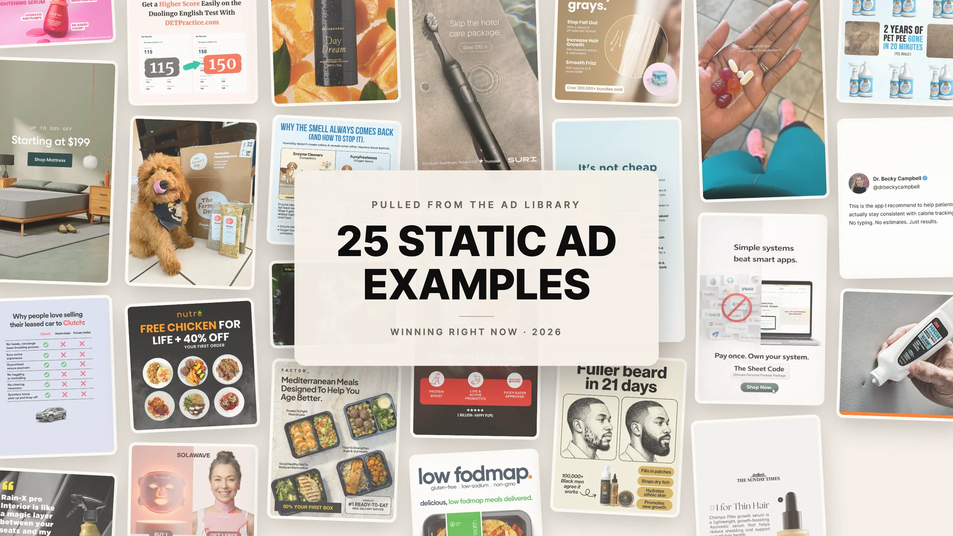
25 real static ad examples pulled from the Meta Ad Library, annotated hook by hook, with the layouts and copy moves you can recreate for your own product.
Table of contents
Most static ad roundups are a designer's mood board: pretty layouts, famous brands, zero evidence any of it converted. We took a different route. Every one of the 25 static ads examples below was pulled from the Meta Ad Library this week, and every one is still spending money after at least 60 days in market. One of them has been running for eight and a half years.
That filter changes what you learn. Advertisers kill losing statics within weeks, so an ad that survives two months of real budget is telling you something no gallery of award winners can.
Below: all 25, sorted into eight categories, with the exact hooks quoted and the craft broken down so you can steal the move, not just admire the ad.
Key Takeaways
- The best static ad examples share one habit: they carry proof inside the creative, whether that is a price anchor, a review quote, a mechanism diagram, or a personalized product shot.
- Longevity is the honest metric. Every example here has run 60+ days on live budget, and the range stretches to 3,101 days, because message-audience fit outlasts polish.
- You do not need a design team to use any of this. Each layout pattern below maps to an archetype you can generate from a product link in minutes.
What Is a Static Ad?
A static ad is a single fixed image ad: one visual, a headline, and a call to action, with no motion or video. It is the workhorse format of Meta, LinkedIn, and display advertising because it loads instantly, makes one argument clearly, and costs almost nothing to produce compared with video, which makes it the natural format for testing hooks and angles before scaling winners.
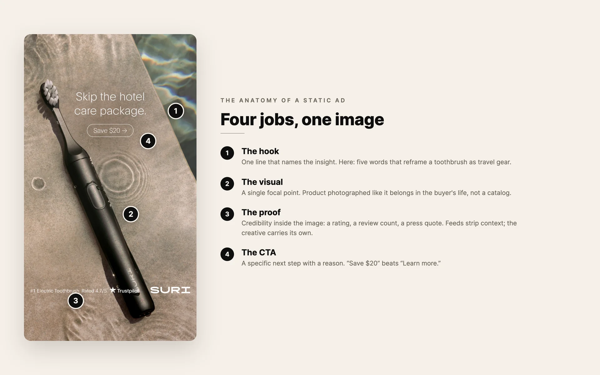
The four jobs every static ad has to do, annotated on SURI's 111-day runner.
How We Picked These 25 Examples
Three rules governed the list. First, every ad had to come from the Meta Ad Library with a visible start date, so "running 449 days" means exactly that as of July 2026. Second, every ad had to be at least 60 days old and still active, our proxy for proven spend. Third, no mega-brand filler: you will find one Fortune 500 name here, and it earned its slot on craft, not fame.
In our own sweep we reviewed 107 live static ads across a dozen verticals to find these 25. The rejects taught us plenty too, and they shaped the rules section at the end.
The 25 Best Static Ad Examples by Category
Jump to a category: Product hero · Before and after · Testimonials · Problem-solution · Offers · Comparison · UGC-style · Feature callouts
Product-hero static ads
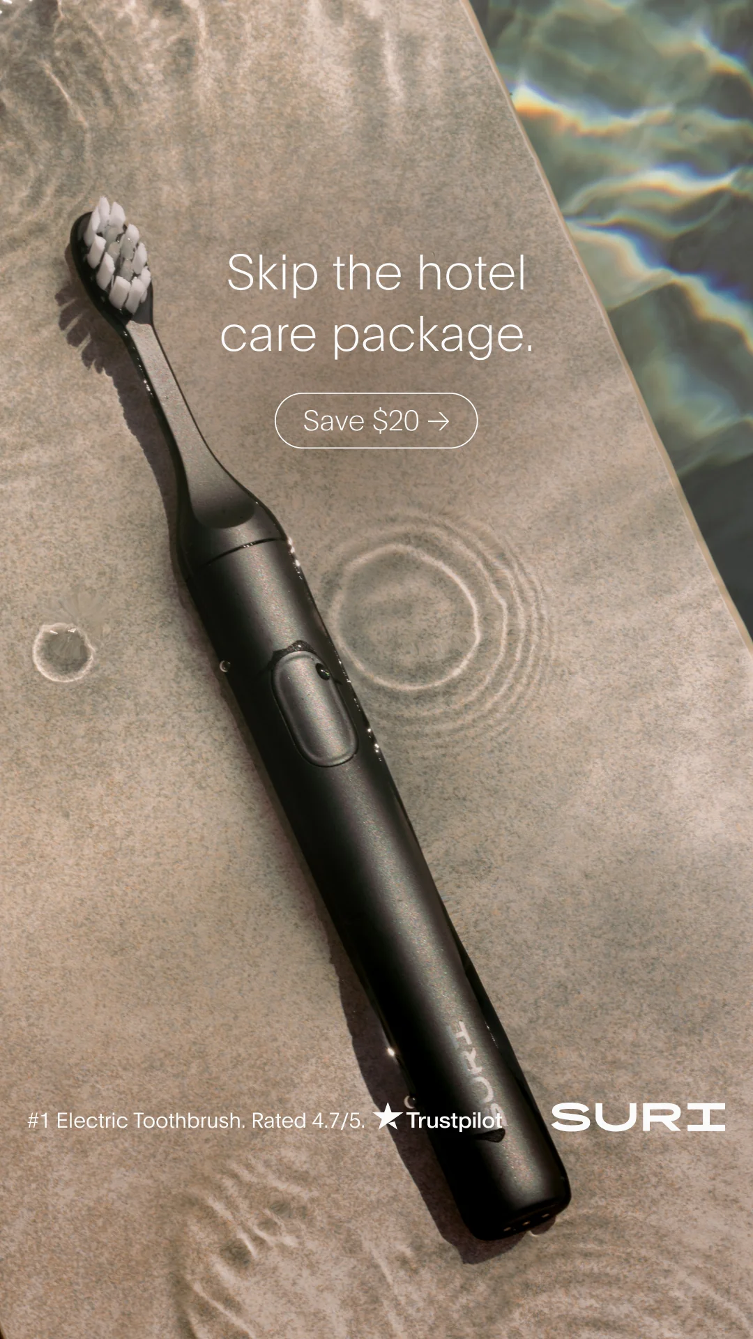
Five words of copy, one Trustpilot line, and photography that does the positioning. Running 111 days. Verify it in the Ad Library.
1. SURI (electric toothbrush · 111 days live · Learn More). A matte black toothbrush photographed on a poolside stone edge, with five words of copy: "Skip the hotel care package." A Trustpilot line ("#1 Electric Toothbrush. Rated 4.7/5") sits quietly at the bottom. The travel insight does the selling; the photography does the positioning. Premium minimalism still needs its proof line, and SURI knows it.

A packshot dressed as a press feature. Borrowed authority in one masthead. Verify it in the Ad Library.
2. Chāmpo (hair care · 90 days live · Shop Now). An amber serum bottle styled like a press feature, with The Sunday Times masthead and the quote "#1 for Thin Hair" as the headline. Borrowed authority turns a packshot into an endorsement. If a publication has ever said anything good about your product, this is the layout that cashes the compliment.
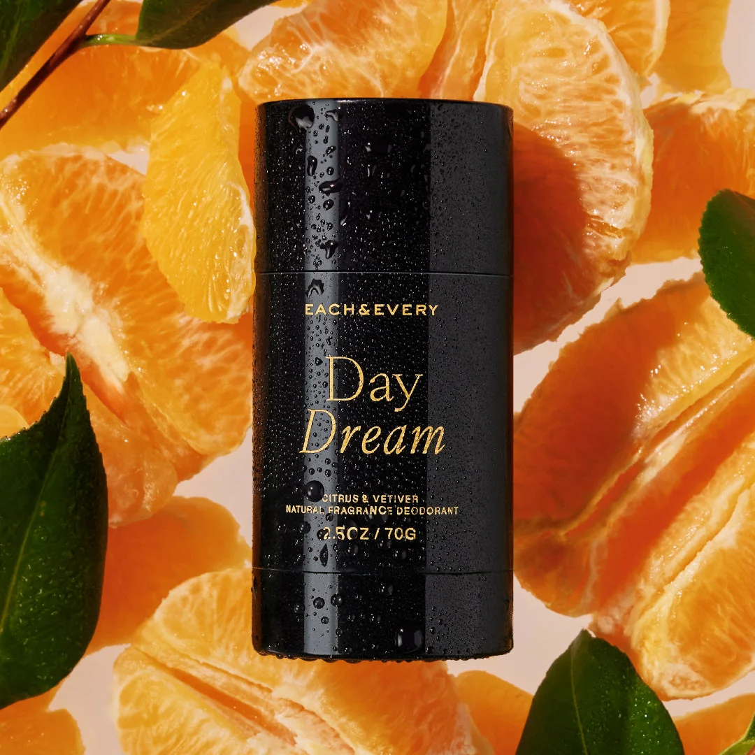
No overlay copy at all. The tangerines are the scent claim. Verify it in the Ad Library.
3. Each & Every (deodorant · 126 days live · Shop Now). A black deodorant stick beaded with water, lying on glistening tangerine segments and green leaves. There is no overlay copy at all; the label carries the words. The background literally is the scent claim. When your product's promise is sensory, art direction can replace a headline entirely.
Before-and-after static ads
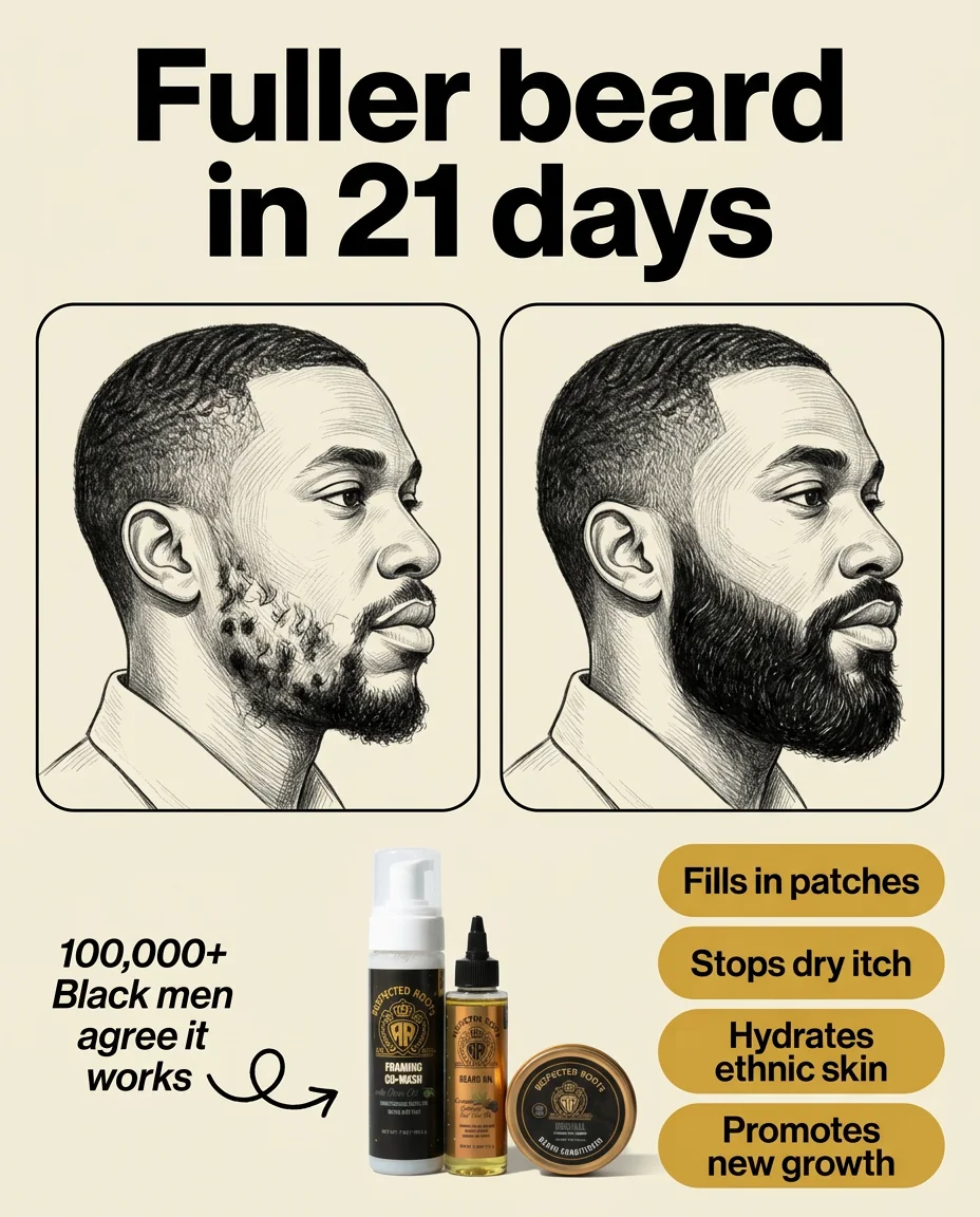
An illustrated transformation sidesteps photo-claim risk and keeps the contrast. Verify it in the Ad Library.
4. Respected Roots (beard care · 61 days live · Shop Now). Two framed pencil-sketch portraits of the same man: patchy beard left, full beard right, over "Fuller beard in 21 days" and "100,000+ Black men agree it works." The illustration sidesteps the policy risk of photographic transformation claims while keeping the contrast, and the audience callout sharpens relevance instead of shrinking it.
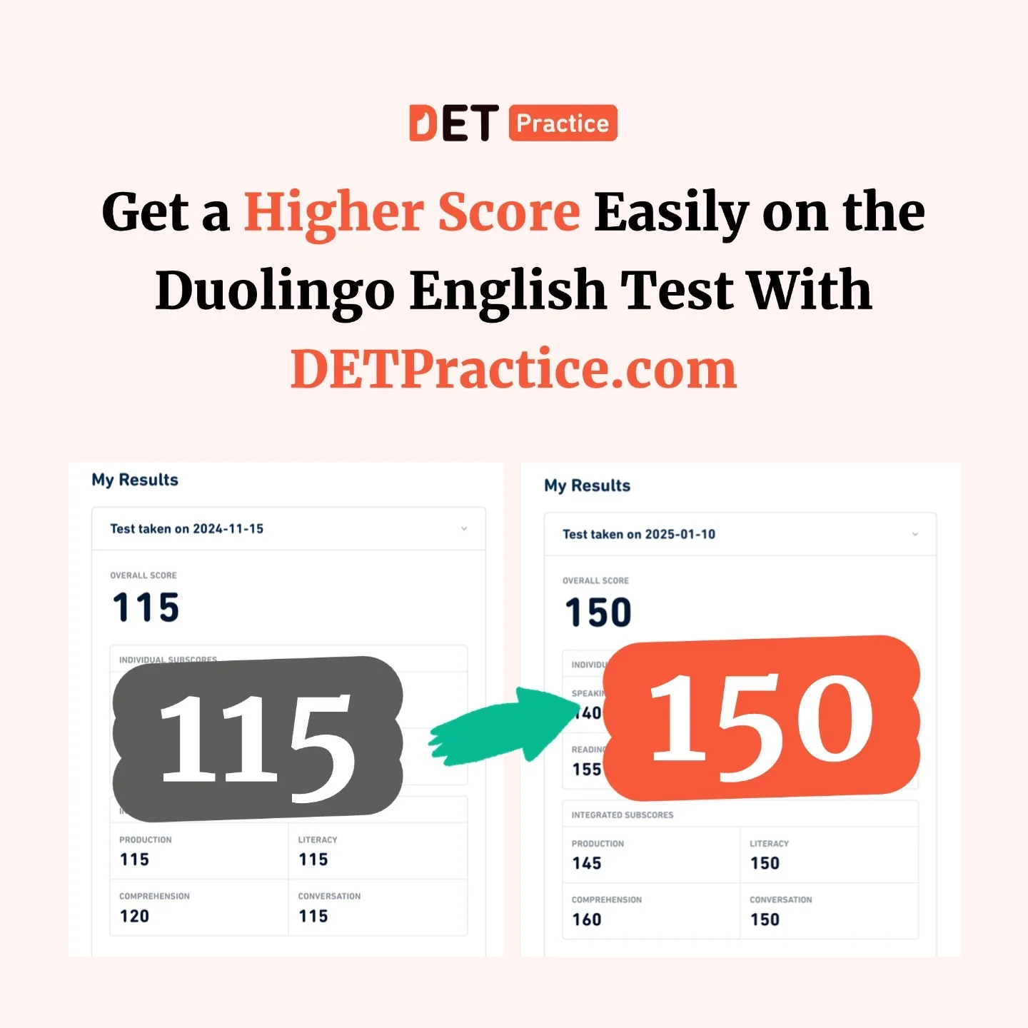
Same interface twice, only the score changes. Proof-shaped design. Verify it in the Ad Library.
5. DET Practice (test prep · 194 days live · Sign Up). Two identical score-report cards side by side, one stamped 115 in gray, one stamped 150 in orange, joined by a hand-drawn arrow. This is the cleanest before/after we found for an intangible product: same UI, only the number changes, and the color shift does the emotional work.
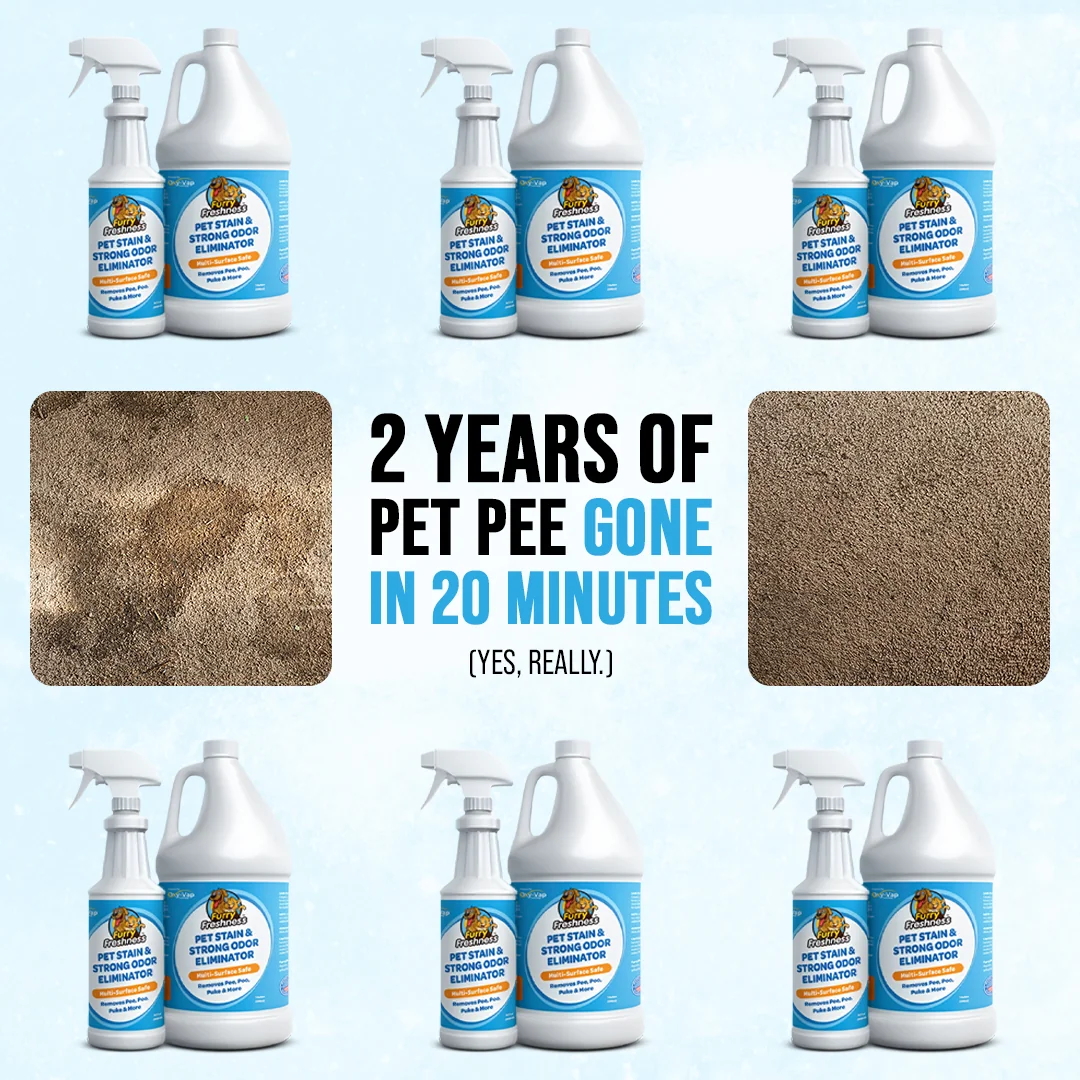
The un-retouched stain photo is the credibility engine. Verify it in the Ad Library.
6. FurryFreshness (pet stain remover · 163 days live · Shop Now). "2 YEARS OF PET PEE GONE IN 20 MINUTES (YES, REALLY.)" over an honestly ugly stained-carpet photo next to a clean one. The un-retouched stain is the credibility engine, and the parenthetical pre-empts disbelief in four words.
Testimonial and review ads
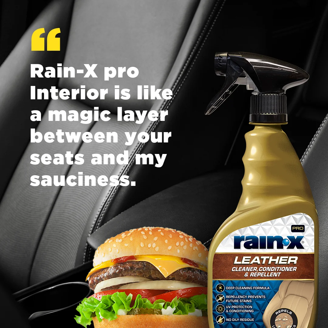
The villain gives the five-star review. A protection claim made funny and visual. Verify it in the Ad Library.
7. Rain-X (auto care · 182 days live · Learn More). A giant glossy cheeseburger poses in front of black leather car seats and delivers the review itself: "Rain-X Pro Interior is like a magic layer between your seats and my sauciness." Handing the quote to the villain makes a protection claim funny and unforgettable, and the joke survives repeat exposure better than sincerity does.
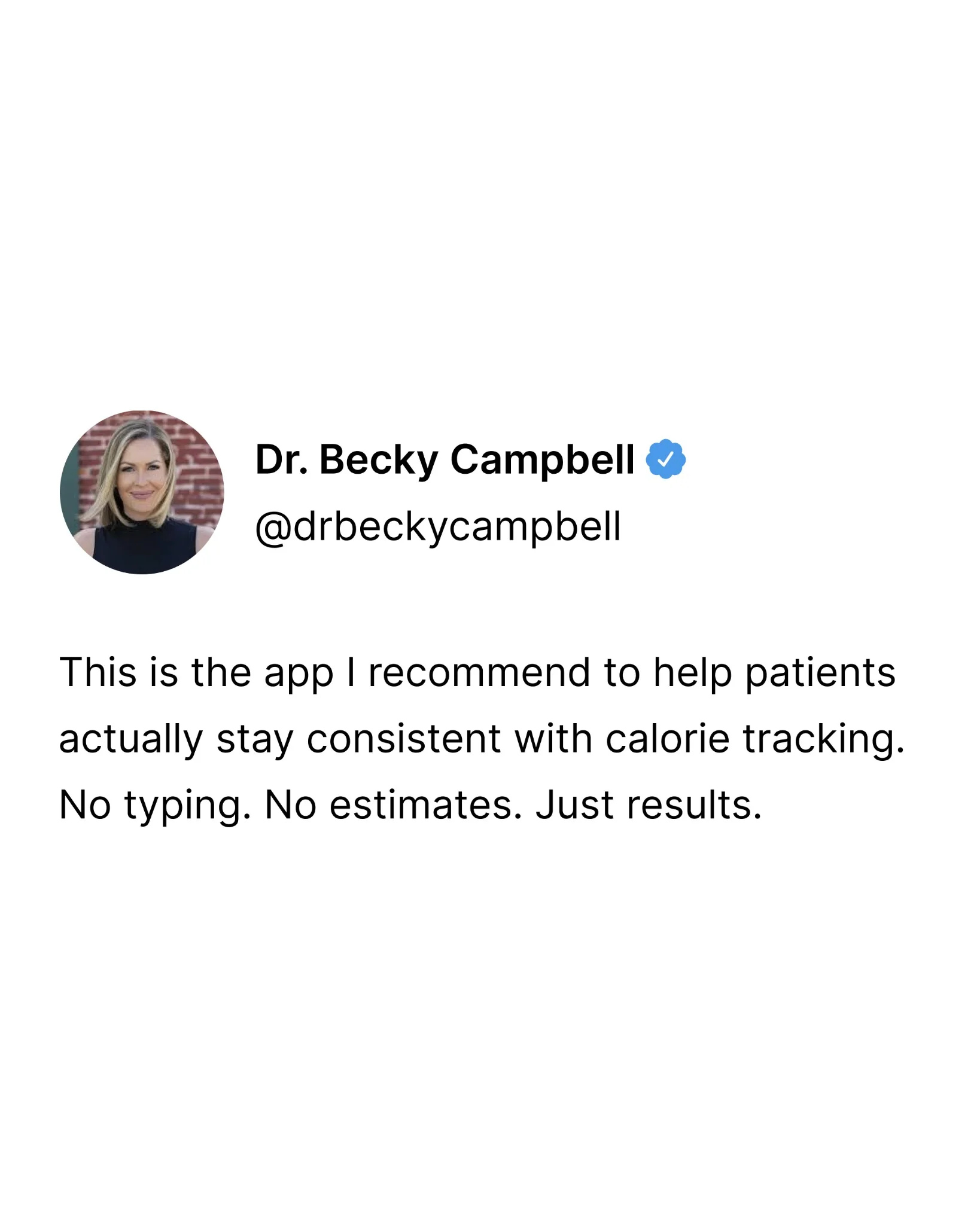
Expert voice in native tweet furniture. Reads like content, lands like an endorsement. Verify it in the Ad Library.
8. Dr. Becky Campbell x MacroFactor-style app (health app · 99 days live). A tweet-format card from a named practitioner: "This is the app I recommend to help patients actually stay consistent with calorie tracking. No typing. No estimates. Just results." Expert-voice testimonial in native social furniture. It reads like content, lands like an endorsement.

Dated design, 3,101 days of continuous spend. Fit beats polish. Verify it in the Ad Library.
9. Wild Growth (hair oil · 3,101 days live · Shop Now). The elder statesman of this list has objectively dated design: red serif type, gold stars, a long verbatim customer quote, a free-from ingredient list. It has also been running since 2017. The lesson is uncomfortable for designers and liberating for founders, because message-audience fit beats polish, and eight years of continuous spend is the receipt.
Problem-solution static ads
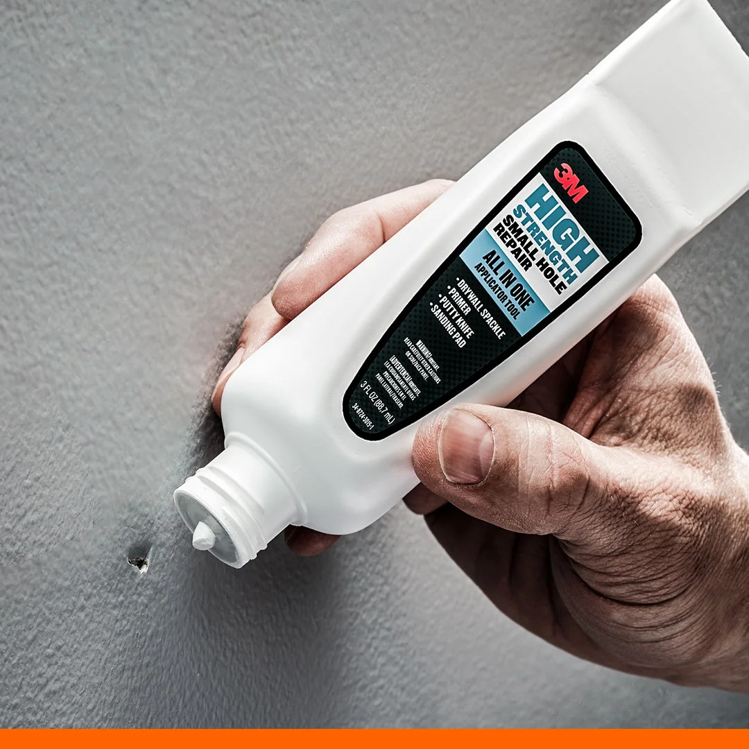
The exact moment of use on the exact problem. No headline needed. Verify it in the Ad Library.
10. 3M x Home Depot (home repair · 70 days live · Shop Now). Two hands squeeze an applicator over a visible nail hole in a grey wall. No headline. The label copy ("High Strength Small Hole Repair, All In One Applicator Tool") carries the differentiation while the photo shows the exact moment of use on the exact problem. Comprehension takes zero seconds.
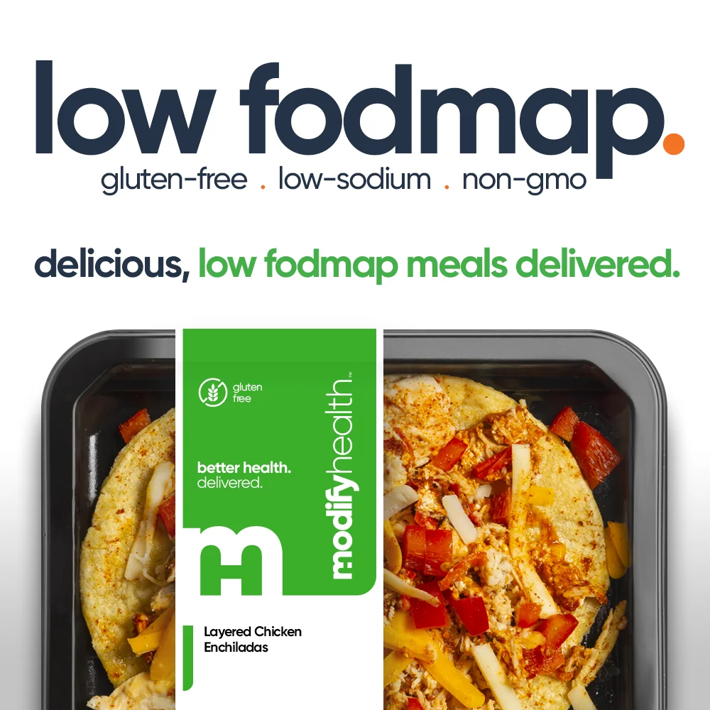
The niche search term as a giant headline. Instant self-selection. Verify it in the Ad Library.
11. ModifyHealth (meal delivery · 240 days live · Get Offer). The headline is just "low fodmap." in giant lowercase type over appetizing meal trays. It leads with the exact term its niche audience searches, which makes the ad a self-selection machine, and the food photography quietly kills the "diet food is sad" objection.
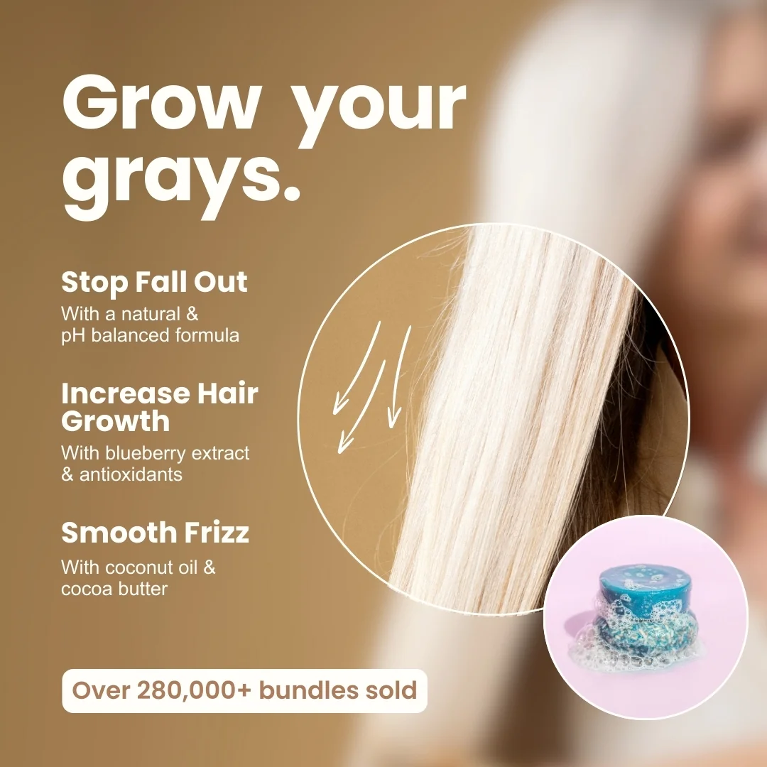
Three words that flip an entire industry script. Verify it in the Ad Library.
12. Humby Organics (silver hair care · 137 days live · Learn More). "Grow your grays." flips an industry built on hiding gray hair, then pairs each benefit with its mechanism: "Increase Hair Growth, with blueberry extract and antioxidants." It claims an underserved segment in three words, and "Over 280,000+ bundles sold" anchors the trust.
Offer and promo ads
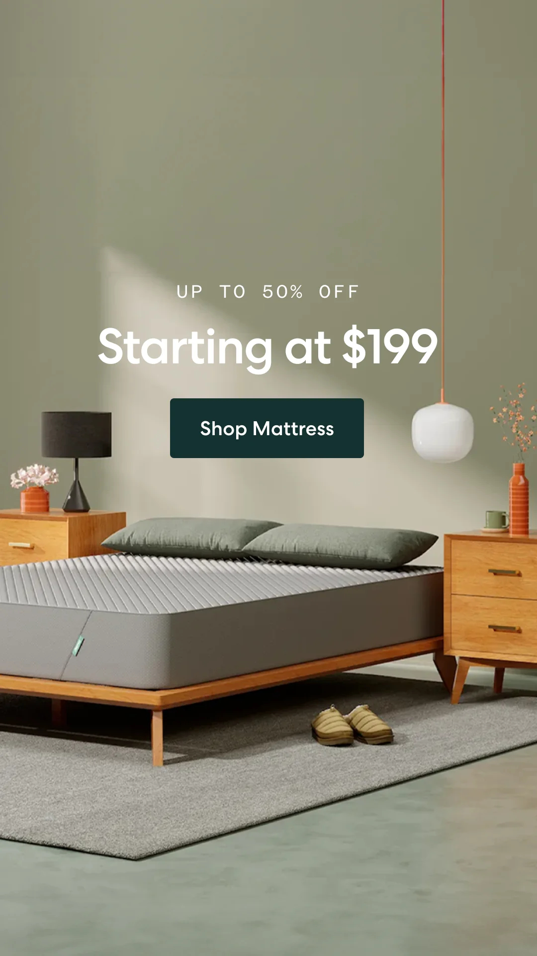
A $199 anchor in a catalog-grade room. Running 845 days. Verify it in the Ad Library.
13. Siena Sleep (mattress · 845 days live · Shop Now). A calm, catalog-grade bedroom with "UP TO 50% OFF" and "Starting at $199" in the first read line. The price anchor removes the biggest mattress objection instantly, and the quiet styling contradicts the budget price, which is exactly the tension that earns the click. This single creative has now run for more than two years.

The BOGO maps visually: one pill per product. The deal explains itself. Verify it in the Ad Library.
14. Solawave (skincare device · 96 days live · Shop the Offer). A red LED mask on a pedestal beside a smiling gray-haired woman wearing the glowing neck device, with two labeled pills mapping "BUY 1" to one product and "GET 1 FREE" to the other. The deal explains itself visually, and casting an older model makes the promise believable for the buyer it targets.
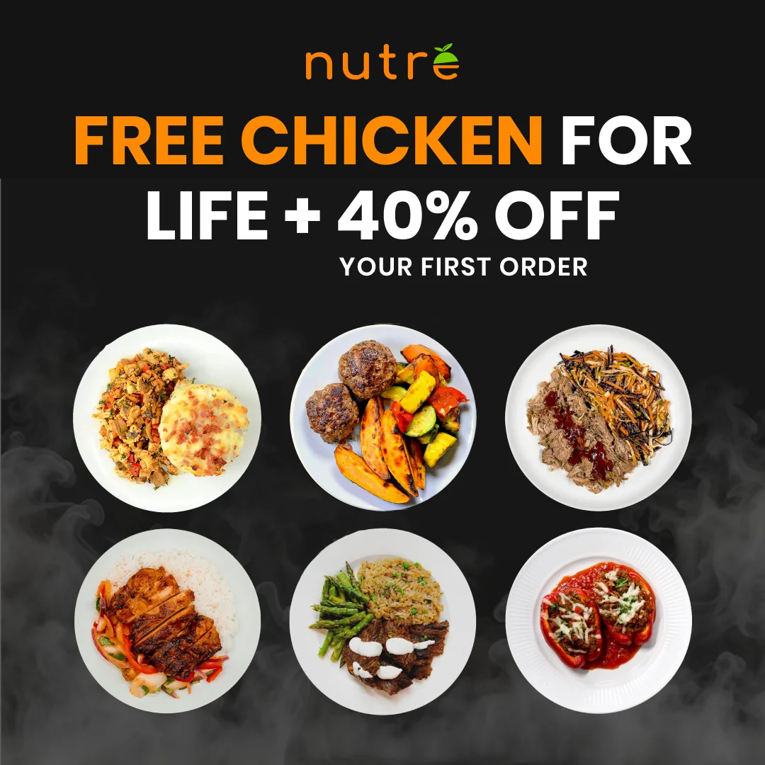
Absurd-sounding, concrete, impossible not to reread. Verify it in the Ad Library.
15. Nutre Meal Plans (meal delivery · 110 days live · Learn More). "FREE CHICKEN FOR LIFE + 40% OFF YOUR FIRST ORDER" over plated meals on black. An absurd-sounding, concrete hook that demands a second read, then a conventional discount to close. Offers do not have to be reasonable to be effective; they have to be specific.
Comparison and us-vs-them ads
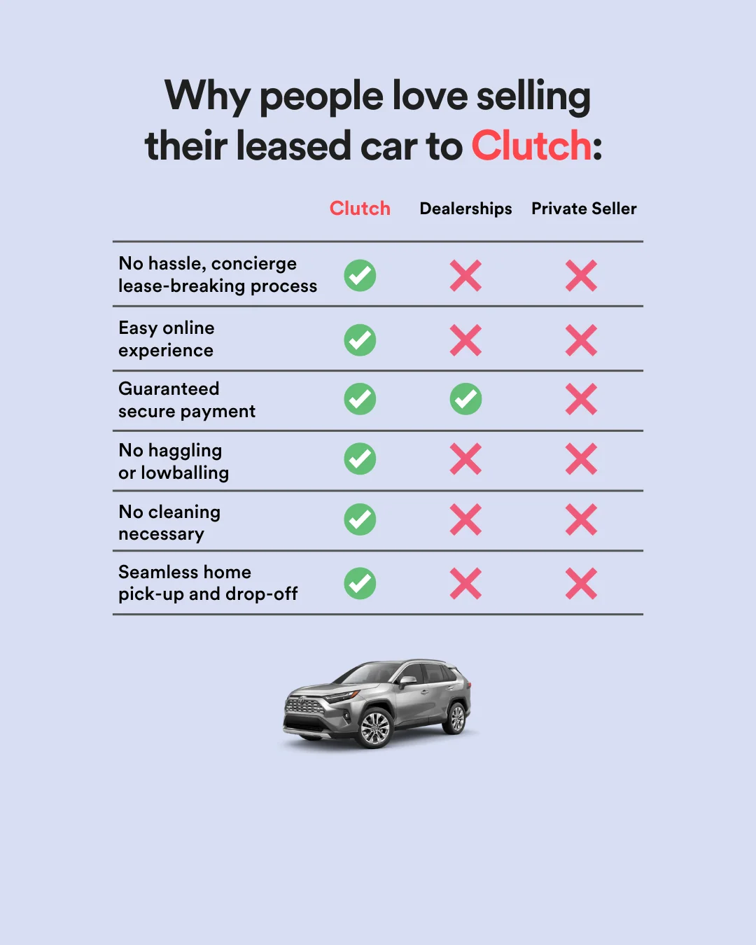
Six rows of green checks argue silently against the default. Verify it in the Ad Library.
16. Clutch (car selling · 264 days live · Get Offer). A three-column check-and-X table: Clutch versus Dealerships versus Private Seller, six rows, all green on the left. The grid does the persuasion in one glance. If your category has a painful default, put it in a column and let the X marks argue for you.
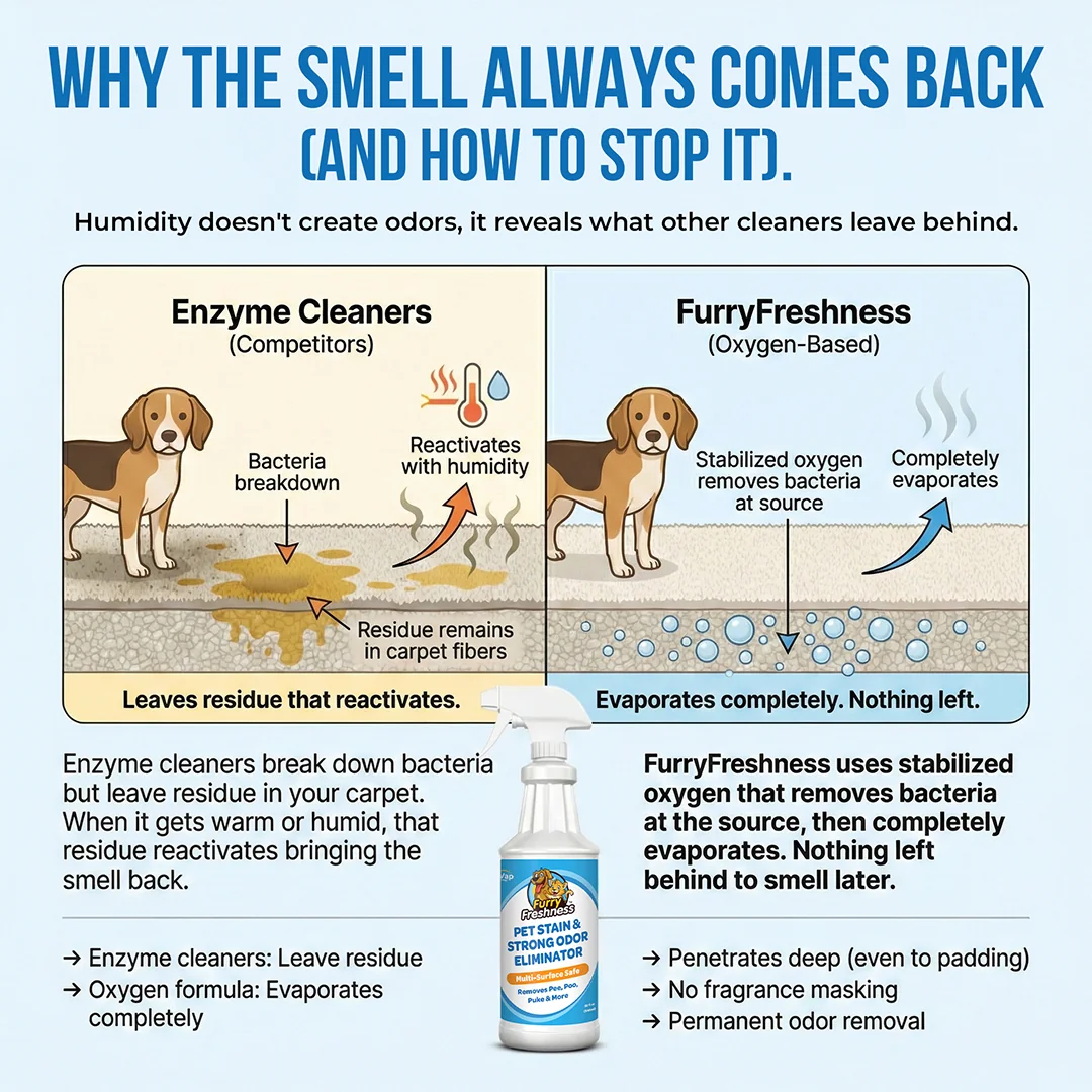
Reframe the category on mechanism, then compare. Competitors lose on physics. Verify it in the Ad Library.
17. FurryFreshness again (163 days live · Shop Now). "WHY THE SMELL ALWAYS COMES BACK (AND HOW TO STOP IT)." A two-panel diagram shows enzyme cleaners leaving residue under carpet fibers versus their oxygen formula evaporating completely. It reframes the category on mechanism before comparing, so competitors lose on physics, not adjectives. The rare ad that teaches something true and sells while doing it.

Crossing out the whole category converts app fatigue into the pitch. Verify it in the Ad Library.
18. The Sheet Code (personal finance · 215 days live · Learn More). Five finance-app logos behind a red prohibition circle on the left; a tidy spreadsheet on the right. "Simple systems beat smart apps. Pay once. Own your system." Crossing out the entire category converts app fatigue into the value proposition, and the ownership line lands the subscription contrast in six words.
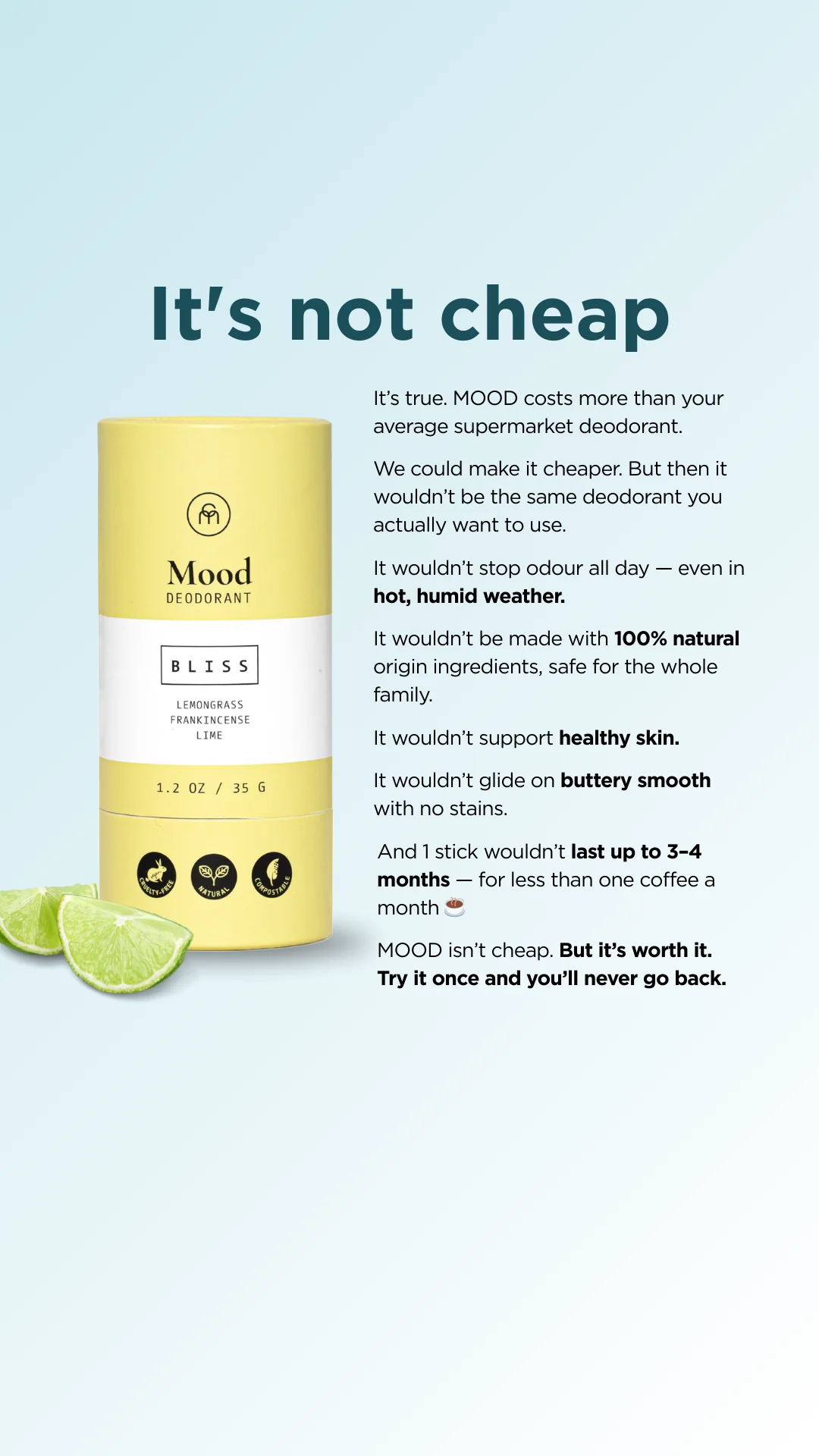
Damaging admission in static form. Every concession is a benefit. Verify it in the Ad Library.
19. Mood by Coconut Matter (deodorant · 215 days live · Shop Now). A long-copy letter that opens "It's not cheap" and then concedes its way to a sale: "We could make it cheaper. But then it wouldn't stop odour all day..." Damaging admission is the oldest trick in direct response because leading with the price objection disarms it before the reader raises it. Every "it wouldn't" line is a benefit wearing a concession's clothes.
UGC-style static ads
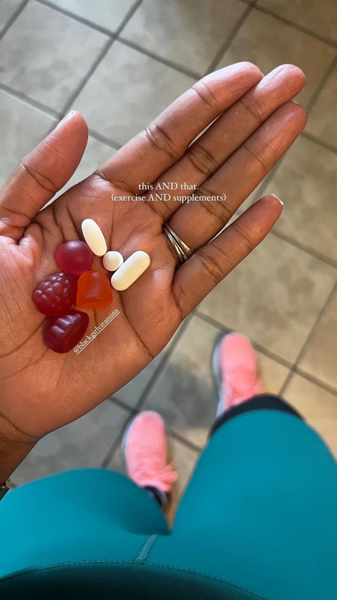
Reads as an organic story post. 554 days and counting. Verify it in the Ad Library.
20. Black Girl Vitamins (supplements · 554 days live · Shop Now). A phone photo of an open palm holding gummies, gym leggings visible below, captioned "this AND that. (exercise AND supplements)". It reads as an organic story post, which buys the scroll stop, and the framing positions supplements as a companion to effort rather than a magic pill. The longest-running UGC static we found.
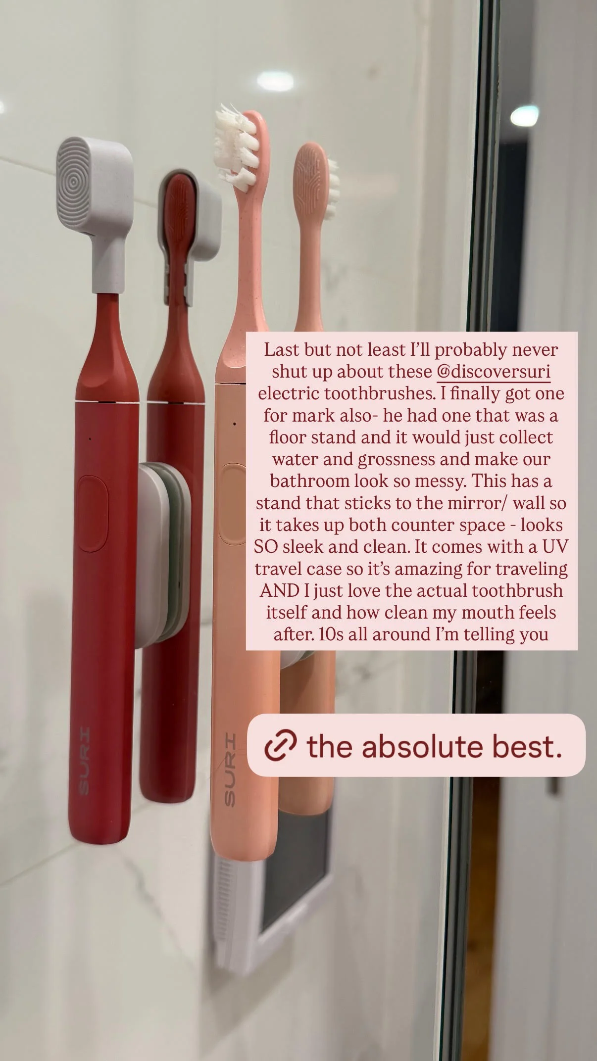
The rambling specificity is the persuasion; the pull-quote is for skimmers. Verify it in the Ad Library.
21. Suri via a creator page (electric toothbrush · 120 days live · Learn More). A bathroom photo under a long typed caption: "...it comes with a UV travel case so it's amazing for traveling... 10s all around I'm telling you." The rambling specificity is the persuasion. A pull-quote pill ("the absolute best.") gives skimmers the verdict while believers read every word.

The personalized pack name demos the product without a line of copy. Verify it in the Ad Library.
22. The Farmer's Dog (fresh dog food · 118 days live · Shop Now). A goldendoodle mid-lick beside a delivery box and food packs labeled "Remus' Chicken Recipe." The unboxing frame shows the subscription end to end, and the personalized pack name quietly demos the product's customization without a single line of copy about it.
Feature-callout ads
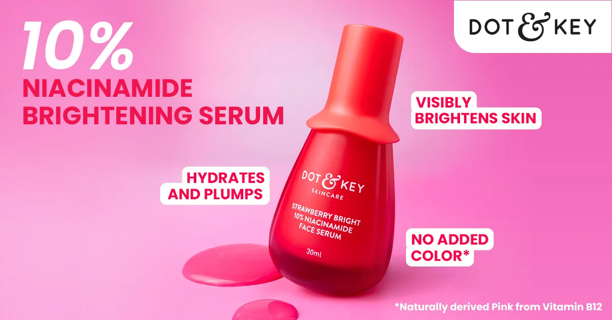
Ingredient-first headline, callout chips, one focal point. Live 449 days. Verify it in the Ad Library.
23. Dot & Key (skincare · 449 days live · Learn More). A red serum bottle on hot pink, ringed by white chips: "10% NIACINAMIDE BRIGHTENING SERUM," "VISIBLY BRIGHTENS SKIN," "HYDRATES AND PLUMPS." Ingredient-first headlines catch high-intent shoppers who already know what niacinamide is, and the monochrome background makes the bottle the only focal point. It has been live for fifteen months.
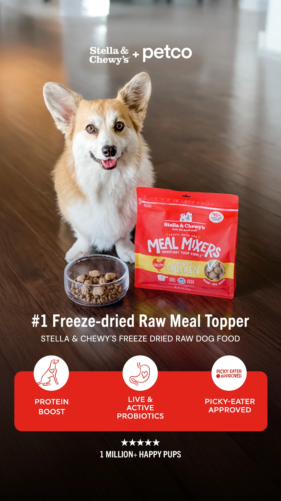
Four proof devices in one frame while the corgi does the emotion. Verify it in the Ad Library.
24. Stella & Chewy's x Petco (dog food · 427 days live · Shop Now). A corgi behind a food bowl, "#1 Freeze-dried Raw Meal Topper," benefit chips, and "1 MILLION+ HAPPY PUPS." Four proof devices stacked in one frame while the dog supplies the emotion. Textbook claim-plus-proof architecture, and fourteen months of spend says the stack holds.
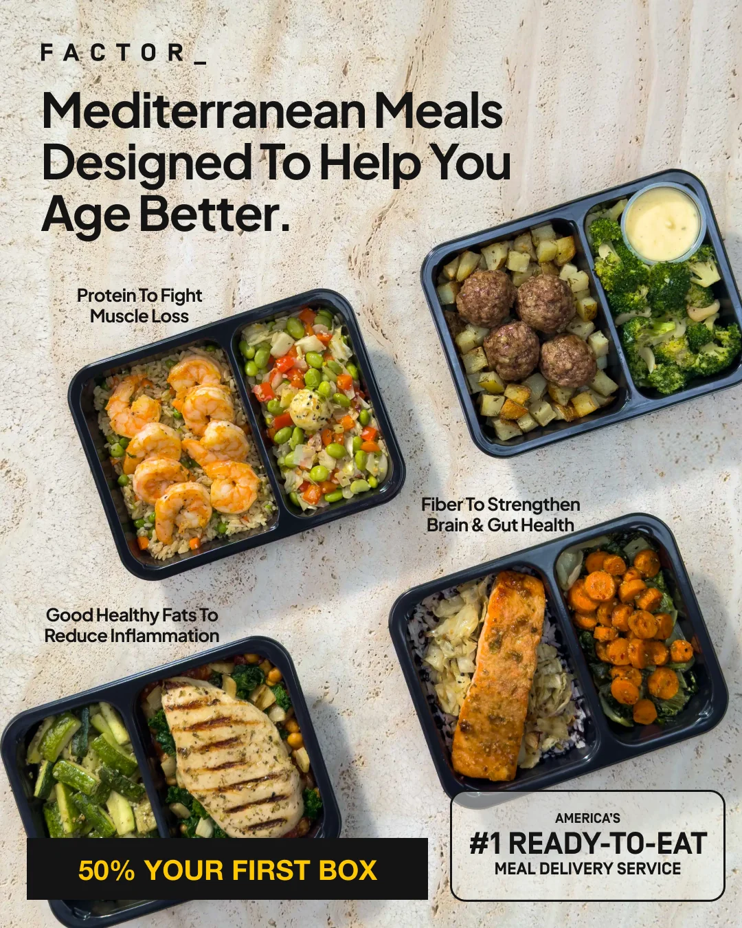
Benefit labels on the actual product photos. The idea leads, the discount follows. Verify it in the Ad Library.
25. Factor (meal delivery · 148 days live · Get Offer). Four meal trays annotated like a diagram: "Protein To Fight Muscle Loss," "Fiber To Strengthen Brain & Gut Health." The headline repositions convenience food as longevity food ("Mediterranean Meals Designed To Help You Age Better"), and the discount is held to the footer so the idea leads.
12 Rules of High-Converting Static Ads
These are not design commandments from a course. They are the patterns the 25 winners above actually share, written down.
- Put proof inside the image. Star ratings, "280,000+ bundles sold," a Trustpilot line, a press masthead. The feed strips context; the creative must carry its own credibility.
- Anchor the price early when price is the objection. "Starting at $199" outperforms vague affordability claims because it replaces anxiety with a number.
- Name your buyer when the product is for someone specific. "Former gifted kids," "100,000+ Black men," "low fodmap." Narrowing the callout raises response inside the niche.
- Lead with the objection you fear most. Mood's "It's not cheap" is the boldest ad on this list and one of the longest running.
- Show the mechanism, not just the claim. FurryFreshness's residue diagram and Humby's ingredient pairings both answer "why would this work" inside the ad.
- One focal point. The pink-on-pink serum, the black stick on orange fruit. Winners control where your eye lands; committee ads point everywhere.
- Make the transformation same-frame. Before and after belongs in one image with matched composition, whether it is a beard sketch or a score report.
- Steal native furniture. Tweet cards, story link stickers, long creator captions. Formats the feed already trusts convert their trust to you.
- Personalization is proof. "Remus' Chicken Recipe" on the pack demonstrates the product promise better than a paragraph about customization.
- Comparison tables argue silently. A check-and-X grid is the highest information-per-second layout in advertising. Use it when the default alternative genuinely hurts.
- Specific beats reasonable. "Free chicken for life" and "2 years of pet pee gone in 20 minutes" out-hook every tasteful generic promise in their categories.
- Let longevity teach you. Wild Growth's 2017-vintage creative embarrasses modern design sensibilities and keeps converting. Refresh ads when performance fatigues, not when aesthetics do.
Static vs Dynamic vs Video: Which Format When
Static ads are the testing and prospecting format: cheapest to produce, fastest to iterate, total creative control. Dynamic catalog ads earn their setup cost in retargeting once you have 20 or more products and a working feed. Video rewards proven angles with more depth, at several times the production cost per test. The working pattern for most brands is statics to find the angle, video to scale it, dynamic to close the browsers. We wrote the full comparison, with a 12-point table and a decision tree, in our static vs dynamic ads guide.
How to Recreate Any of These Ads in Minutes
Every example above maps to a layout archetype: product hero, feature callout, offer badge, social proof, lifestyle UGC. Those five archetypes are exactly what AskEditor's static ad generator builds from a product link. Paste your URL, and it pulls your product images, brand colors and logo, writes headline, subheading and CTA copy, and generates a diverse set across the archetypes in the aspect ratios you pick.
In our own runs a five-creative set lands in about four minutes, which means testing all eight categories above against your product is an afternoon, not a design sprint.
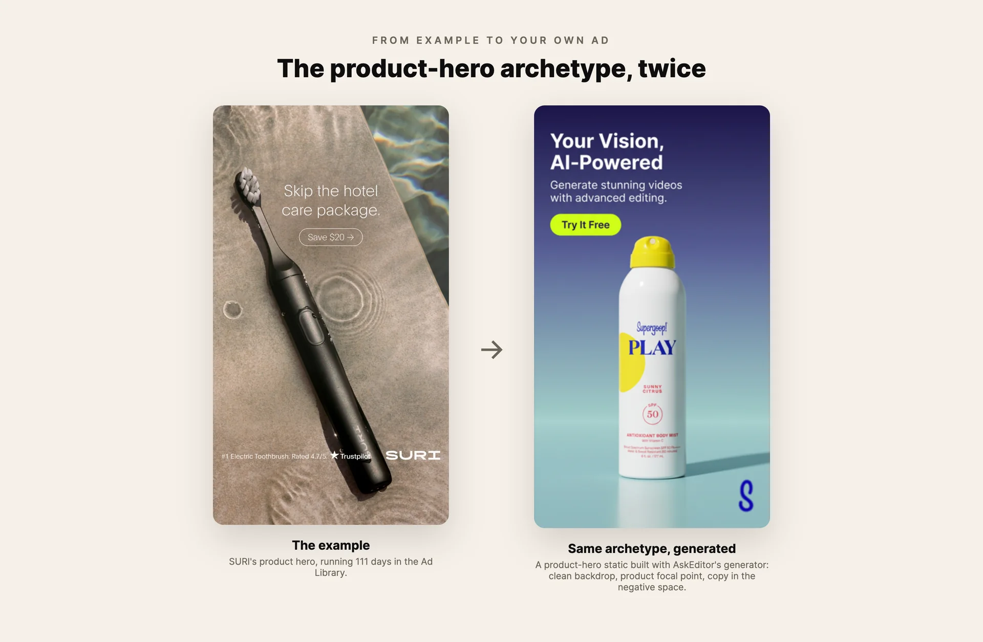
The same archetype, twice: the Ad Library example next to a product hero generated with AskEditor.
Frequently Asked Questions
What makes a static ad high-converting? The pattern across long-running winners: one clear focal point, proof embedded in the image, a specific rather than reasonable promise, and a hook that either names its audience or pre-empts its biggest objection. Polish matters less than fit; the oldest ad on this list would fail a design review.
Do static ads still work in 2026? The evidence says emphatically yes. Every ad above is spending real money right now, several have run for years, and statics remain the dominant prospecting and testing format on Meta because they cost a fraction of video to produce and iterate.
How do I find static ad examples in my own niche? Search the Meta Ad Library for your category or competitors, then check each ad's start date. Anything running 60+ days is working well enough to keep funding. Sorting by longevity, not by looks, is how this list was built.
How many static ad variants should I test? Serious accounts test 15 to 25 statics a month. The realistic minimum is 3 to 5 distinct angles (not color tweaks) per campaign, killed or scaled within two weeks. AI generation has removed the production excuse.
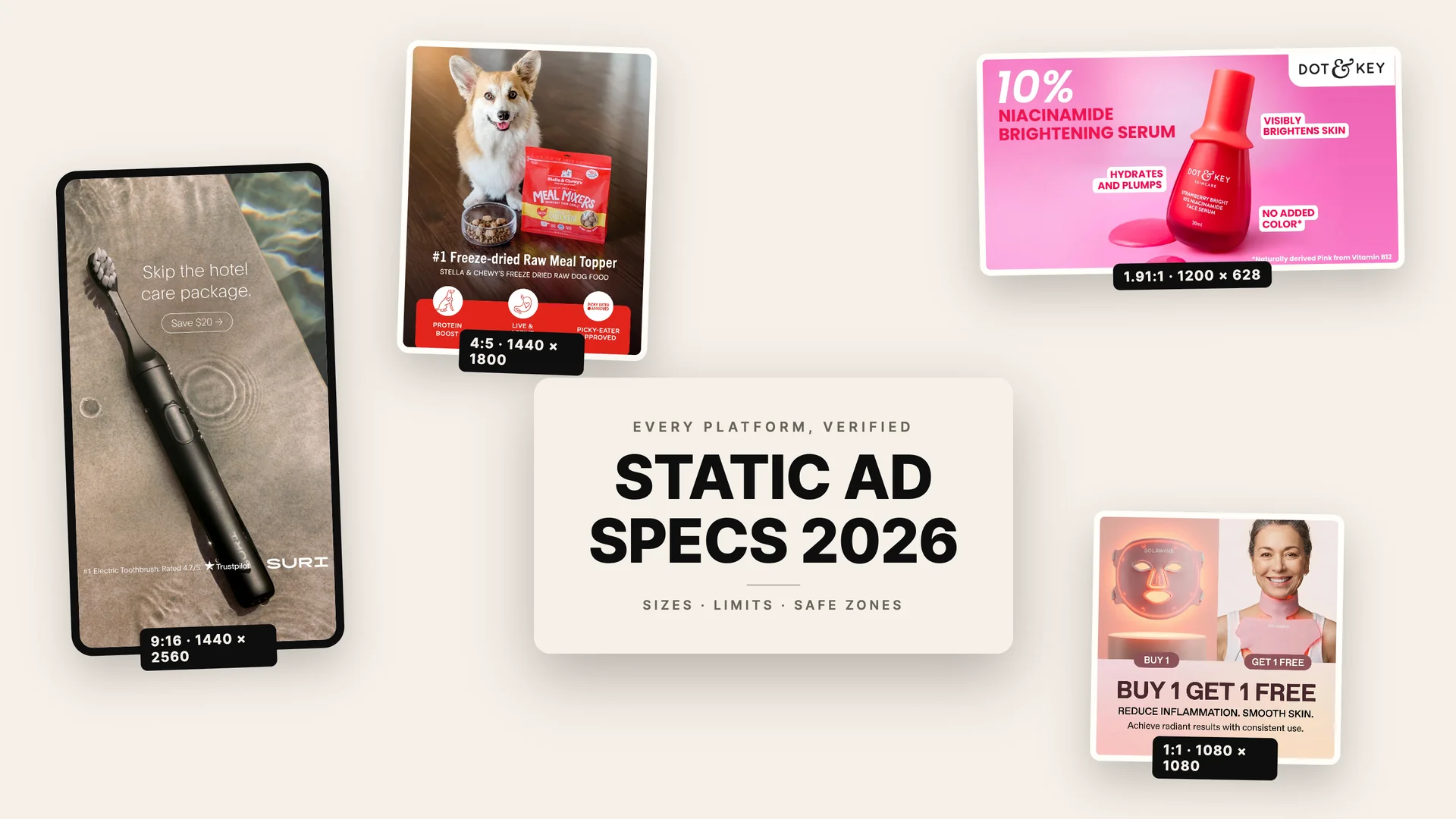
What size should static ads be? For Meta feed, 4:5 at 1440 x 1800 pixels; for Stories, 9:16 at 1440 x 2560. Every platform's current numbers, verified against official docs, are in our static ad specs guide.
Next Steps
The gap between reading about winning ads and running some has never been thinner. Pick the three categories that fit your product, borrow the moves above, and put real variants into the auction this week.
When you want the production step to take minutes instead of days, paste your product link into AskEditor's static ad generator and test every angle on this page against your own product.
AskEditor Team
Guides on making marketing video with AI, from the team building AskEditor.